
Theming
Claudette ships with 14 built-in themes — built on the Claude Design token system — and supports custom themes you can create and share.
Switching Themes
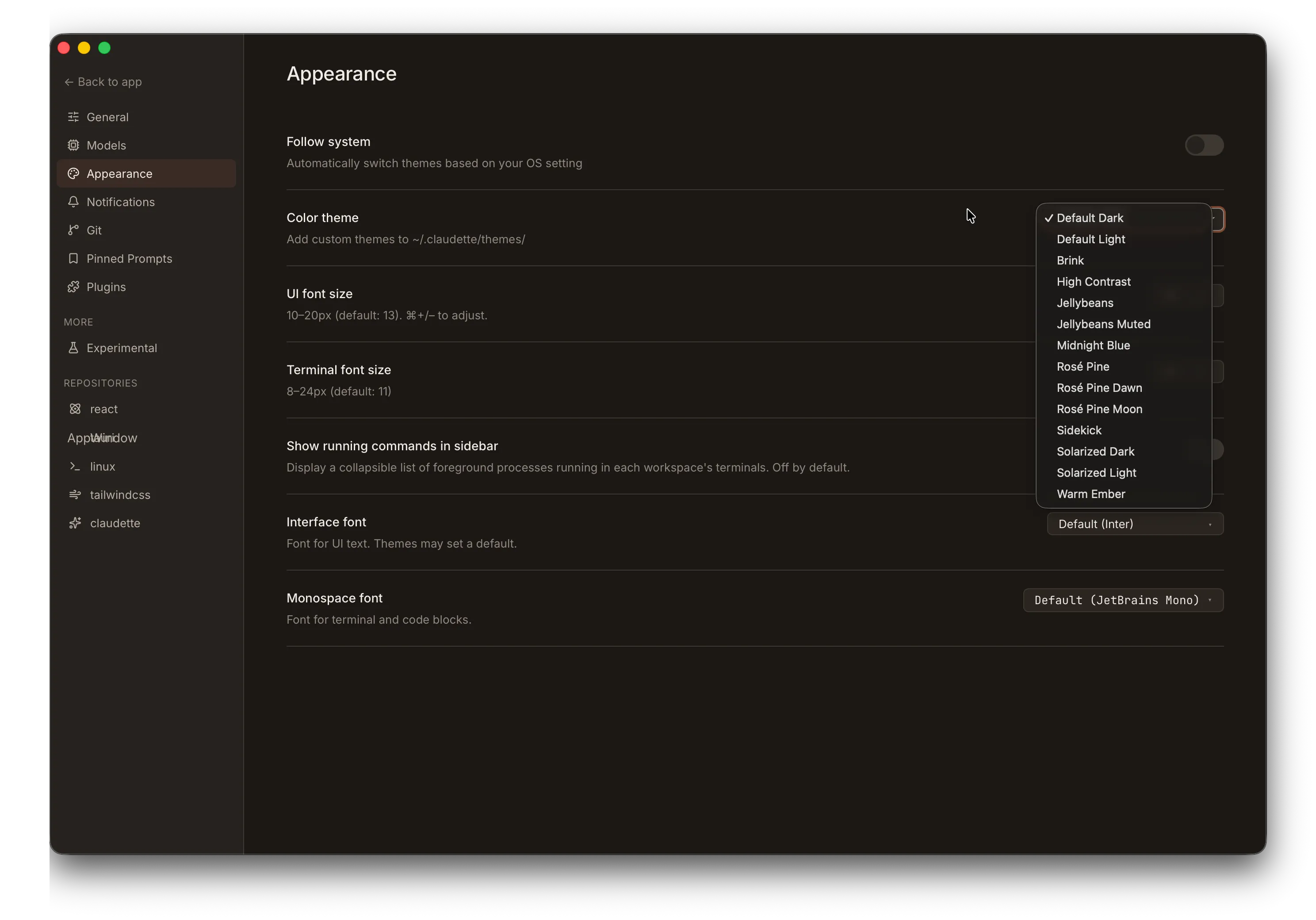
Section titled “Switching Themes”Open Settings > Appearance (or press ⌘/Ctrl + ,) and select a theme from the dropdown.
Follow System
Section titled “Follow System”Enable Follow system to let Claudette automatically switch themes based on your OS light/dark preference. When active, two independent theme selectors appear — one for dark mode and one for light mode — so you can pair any built-in or custom theme with either OS state.
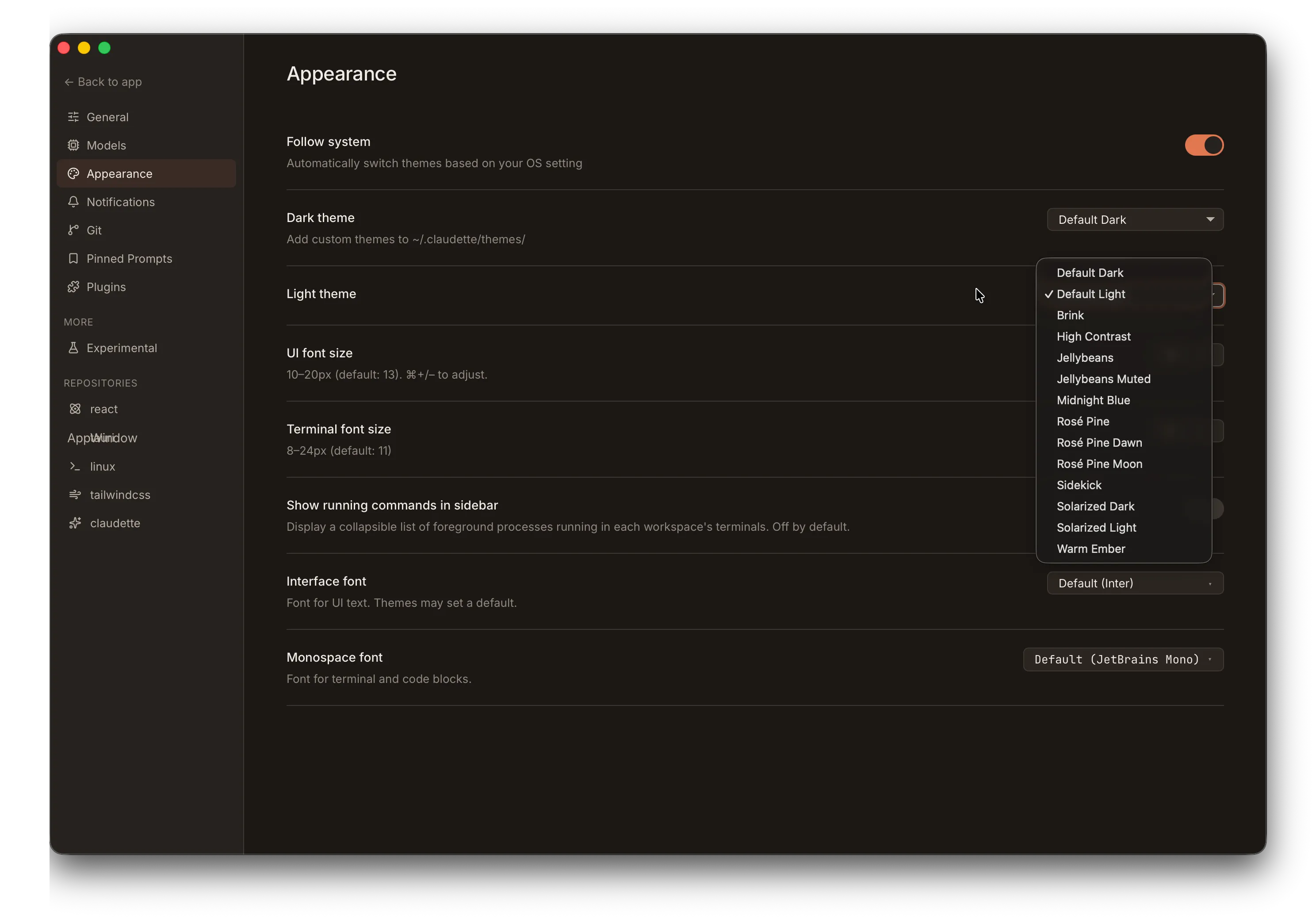
The switch takes effect immediately whenever your OS preference changes, with no restart required.
Built-in Themes
Section titled “Built-in Themes”| Theme | Style |
|---|---|
| Default Dark | Claudette’s signature theme — coral on warm charcoal (default) |
| Default Light | Cream paper with deep coral accents |
| Jellybeans | Dark Vim-inspired palette with cool slate accent |
| High Contrast | Maximum legibility with cyan accent |
| Rosé Pine | Soho-vibes dark with iris accent |
| Rosé Pine Moon | Rosé Pine on warmer navy base |
| Rosé Pine Dawn | Rosé Pine light — cream parchment with iris accent |
| Solarized Dark | Schoonover’s canonical dark with blue accent |
| Solarized Light | Solarized inverted monotones with identical accents |
| Brink | Mid-tone warm chrome with Ristretto-style gold accent |
| Jellybeans Muted | Softer, desaturated take on Jellybeans |
| Midnight Blue | Cool blue-tinted dark theme |
| Warm Ember | Warm amber-toned dark theme |
| Sidekick | Ship Sidekick brand — deep navy with electric violet |
Custom Themes
Section titled “Custom Themes”Create your own themes by placing JSON files in:
~/.claudette/themes/Each file must be valid JSON with the following structure:
{ "id": "my-custom-theme", "name": "My Custom Theme", "author": "Your Name", "description": "A brief description of the theme", "colors": { "color-scheme": "dark", "accent-primary": "#e07850", "accent-primary-rgb": "224, 120, 80", "app-bg": "rgb(28, 24, 21)", "text-primary": "rgb(240, 235, 229)" }}Required Fields
Section titled “Required Fields”| Field | Type | Description |
|---|---|---|
id | string | Unique identifier (used internally) |
name | string | Display name shown in the theme picker |
colors | object | Map of CSS custom property names to values |
Optional Fields
Section titled “Optional Fields”| Field | Type | Description |
|---|---|---|
author | string | Theme author name |
description | string | Brief description |
Theme File Limits
Section titled “Theme File Limits”- Maximum file size: 1 MB
- File format: JSON (
.jsonextension) - Custom themes with the same
idas a built-in theme will override the built-in
Fallbacks
Section titled “Fallbacks”Any property you omit inherits the value from the Default Dark theme. You only need to specify the tokens you want to change — a theme file containing a single accent override is valid and will render correctly, with every other surface falling back to the default palette.
Importing Base16 Themes
Section titled “Importing Base16 Themes”Claudette auto-detects and imports themes from the Base16 family — a community palette format that defines a theme with just 16 colors (base00–base0F). Drop a canonical Base16 JSON file into ~/.claudette/themes/, restart, and it shows up in the theme picker alongside any native Claudette themes.
Two on-disk shapes are recognized:
-
Flat —
base00,base01, … directly at the top level. This is the legacy Base16 JSON shape used by many community generators. -
Nested under
palette— the current Tinted Theming spec (0.11+) wraps the base keys in apaletteobject alongside top-levelsystem,name,variant,authorfields:{"system": "base16","name": "Tomorrow Night","variant": "dark","palette": {"base00": "1d1f21","base01": "282a2e","...": "...","base0F": "a3685a"}}YAML schemes from
tinted-theming/schemesuse this shape; running them through any YAML→JSON converter and dropping the result into~/.claudette/themes/works directly.
Detection is automatic: a file is treated as Base16 if it provides all 16 base00–base0F slots (either shape, hex values 3- or 6-char with or without a leading #) and does not also declare any native Claudette tokens like accent-primary or app-bg. A file with both is treated as a Claudette theme — its author already chose what to map.
The 16 base colors map onto Claudette’s token vocabulary as follows:
| Base16 | Role | → Claudette tokens |
|---|---|---|
base00 | default background | app-bg, terminal-bg |
base01 | lighter background | sidebar-bg, chat-header-bg, terminal-tab-bg |
base02 | selection background | selected-bg, terminal-tab-active-bg, divider |
base03 | comments / faint | text-faint, text-dim, syntax-comment, diff-line-number |
base04 | dimmer foreground | text-muted, accent-neutral |
base05 | default foreground | text-primary, terminal-fg |
base06 | bright foreground emphasis | unmapped — see note below |
base07 | lightest | on-accent |
base08 | red | accent-error family, status-stopped, diff-removed-text, syntax-variable |
base09 | orange | accent-warning family, syntax-number |
base0A | yellow | badge-ask, syntax-type |
base0B | green | accent-success family, badge-done, diff-added-text, syntax-string |
base0C | cyan | syntax-operator |
base0D | blue | accent-info family, badge-plan, diff-hunk-header, syntax-function |
base0E | purple | accent-primary, accent-tertiary family, syntax-keyword |
base0F | brown | accent-dim, accent-secondary family |
“family” above means the base color plus its derived -bg / -border / -hover / -fg companions. The base16 converter sets only the base; the companions derive in :root via color-mix(), so the whole family adapts together.
The light/dark color-scheme is read from an optional variant: "light" or variant: "dark" field if present, otherwise inferred from base00’s relative luminance. Base key names are case-insensitive (base0A and base0a both work). The conversion happens in-memory at load time — no Claudette-format file is written back to disk.
Color Properties Reference
Section titled “Color Properties Reference”You can customize any of the following CSS custom properties.
Scheme
Section titled “Scheme”| Property | Description |
|---|---|
color-scheme | "dark" or "light" — controls native UI elements and syntax highlighting |
Accent Colors
Section titled “Accent Colors”| Property | Description |
|---|---|
accent-primary | Primary accent color (e.g., #e07850) |
accent-primary-rgb | RGB values for opacity variants (e.g., 224, 120, 80) |
accent-dim | Dimmed accent for less prominent elements |
accent-bg | Transparent accent background (e.g., rgba(224, 120, 80, 0.08)) |
accent-bg-strong | Stronger accent background |
accent-glow | Glow/shadow effect (e.g., 0 0 12px rgba(224, 120, 80, 0.25)) |
mascot-pink | Secondary brand pink used for the mascot and highlight accents |
mascot-pink-dim | Dimmed mascot pink for subtler highlights |
| Property | Description |
|---|---|
text-primary | Main text color |
text-muted | Secondary text |
text-dim | Tertiary text |
text-faint | Very subtle text |
text-separator | Separator/divider text color |
Backgrounds
Section titled “Backgrounds”| Property | Description |
|---|---|
app-bg | Main application background |
sidebar-bg | Sidebar background |
sidebar-border | Sidebar border color |
chat-input-bg | Chat input field background |
chat-header-bg | Chat panel header |
chat-user-bg | User message bubble background |
chat-system-bg | System message background |
Terminal
Section titled “Terminal”| Property | Description |
|---|---|
terminal-tab-bg | Inactive terminal tab background |
terminal-tab-active-bg | Active terminal tab background |
terminal-bg | Terminal panel background color |
terminal-fg | Terminal text (foreground) color |
terminal-cursor | Terminal cursor color |
terminal-selection | Terminal text selection background |
Interactive States
Section titled “Interactive States”| Property | Description |
|---|---|
hover-bg | Hover background |
hover-bg-subtle | Subtle hover background |
selected-bg | Selected item background |
Status Indicators
Section titled “Status Indicators”| Property | Description |
|---|---|
status-running | Running/active agent color |
status-idle | Idle agent color |
status-stopped | Stopped/error color |
Attention Badges
Section titled “Attention Badges”| Property | Description |
|---|---|
badge-done | Agent finished badge color |
badge-plan | Plan awaiting review badge color |
badge-ask | Agent question badge color |
Semantic Accents
Section titled “Semantic Accents”Semantic tokens express meaning, not color. New consumers should prefer these over the older badge-*, status-*, and error-* tokens. Each family is a five-token group: the base color, plus pre-derived -bg / -border / -hover / -fg layers. A chip-style component can compose a filled-and-bordered surface (with a hover state) from tokens alone — no color-mix() calls or per-component alpha math.
| Property | Description |
|---|---|
accent-success | Successful action / positive confirmation. Aliases --badge-done by default. |
accent-success-bg | Tinted surface (10% alpha of base, via color-mix()) |
accent-success-border | Outline (30% alpha) |
accent-success-hover | Hover state for interactive surfaces (15% alpha) |
accent-success-fg | Foreground text color when used on accent-success-bg |
accent-warning | Caution / non-fatal warning (and -bg, -border, -hover, -fg) |
accent-error | Error / destructive action. Aliases --status-stopped by default. (and -bg, -border, -hover, -fg) |
accent-info | Informational / neutral notice. Aliases --badge-plan by default. (and -bg, -border, -hover, -fg) |
accent-neutral | Muted emphasis text or icon — aliases --text-muted |
accent-secondary | Secondary brand accent. Aliases --mascot-pink by default. (and -bg, -border, -fg — no -hover) |
accent-tertiary | Tertiary brand accent (and -bg, -border, -fg — no -hover) |
Category Slots (A–H)
Section titled “Category Slots (A–H)”Eight pre-styled chip palettes for “item N of a set” UI — plugin badges, env-provider chips, future workspace tags. The default palette is brand-invariant: the same eight hues appear across most themes so the color identity of “category C” stays recognizable when users switch theme.
Themes with a strong canonical palette (Rosé Pine, Solarized) deliberately override these slots in their [data-theme] block so chips render in the theme’s own native colors. If you’re authoring a custom theme and your palette has its own identity, follow that pattern.
Each slot ships as a -bg / -border / -fg triplet (no -rgb companion — these aren’t expected to be alpha-composed at the call site). Use them directly:
.workspace-tag { background: var(--category-c-bg); border: 1px solid var(--category-c-border); color: var(--category-c-fg);}| Property | Default hue |
|---|---|
category-a-bg / -border / -fg | Rose |
category-b-bg / -border / -fg | Orange |
category-c-bg / -border / -fg | Amber |
category-d-bg / -border / -fg | Green |
category-e-bg / -border / -fg | Teal |
category-f-bg / -border / -fg | Blue |
category-g-bg / -border / -fg | Purple |
category-h-bg / -border / -fg | Pink |
Syntax Highlights
Section titled “Syntax Highlights”Eight tokens that mirror Base16’s base08–base0F semantic roles so syntax-highlight surfaces can share a vocabulary with imported Base16 themes. These are intentionally brand-invariant — they ship on :root and most themes inherit them unchanged.
| Property | Description |
|---|---|
syntax-keyword | Control flow / if, for, return (base0E — purple) |
syntax-string | String literals (base0B — green) |
syntax-number | Numeric and boolean constants (base09 — orange) |
syntax-comment | Comments and docs (base03 — faint) |
syntax-function | Function and method names (base0D — blue) |
syntax-type | Types, classes, search highlights (base0A — yellow) |
syntax-variable | Variables (base08 — red) |
syntax-operator | Operators, punctuation, separators, terminators, braces, regexp (base0C — cyan) |
Diff View
Section titled “Diff View”| Property | Description |
|---|---|
diff-added-bg | Added line background |
diff-removed-bg | Removed line background |
diff-added-text | Added line text color |
diff-removed-text | Removed line text color |
diff-hunk-header | Hunk header color |
diff-line-number | Line number color |
Chrome
Section titled “Chrome”| Property | Description |
|---|---|
divider | Divider/separator lines |
toolbar-active | Active toolbar button background |
toolbar-active-text | Active toolbar button text |
error-bg | Error surface background |
error-border | Error surface border |
error-hover | Error surface hover state |
overlay-bg | Scrim behind modals and popovers |
overlay-bg-heavy | Stronger scrim for opaque overlays |
shadow-sm | Small box shadow |
shadow-md | Medium box shadow |
shadow-lg | Large box shadow |
shadow-card-hover | Card hover shadow |
Typography
Section titled “Typography”Typography tokens are themeable but most themes leave them at the Default Dark stacks. Override them to ship a theme with its own typographic voice — user-level font preferences set in Settings > Appearance still take precedence over whatever a theme specifies.
| Property | Description |
|---|---|
font-sans | UI sans-serif font stack (e.g., "Inter", system-ui, sans-serif) |
font-mono | Monospace font stack used by code blocks and terminal tabs |
font-display | Display font stack for headings and brand surfaces |
Example: Creating a Theme
Section titled “Example: Creating a Theme”Here’s a complete example based on the built-in Warm Ember theme:
{ "id": "warm-ember", "name": "Warm Ember", "author": "Claudette", "description": "A warm amber-toned dark theme", "colors": { "color-scheme": "dark", "accent-primary": "#f0a050", "accent-primary-rgb": "240, 160, 80", "accent-dim": "#cc8840", "accent-bg": "rgba(240, 160, 80, 0.08)", "accent-bg-strong": "rgba(240, 160, 80, 0.15)", "accent-glow": "0 0 12px rgba(240, 160, 80, 0.25)", "sidebar-bg": "rgb(26, 22, 18)", "sidebar-border": "rgb(48, 40, 32)", "text-primary": "rgb(240, 232, 220)", "text-muted": "rgb(160, 145, 130)", "text-dim": "rgb(130, 118, 105)", "text-faint": "rgb(100, 90, 78)", "text-separator": "rgb(75, 65, 55)", "hover-bg": "rgba(255, 200, 120, 0.06)", "hover-bg-subtle": "rgba(255, 200, 120, 0.04)", "selected-bg": "rgba(240, 160, 80, 0.1)", "divider": "rgb(50, 42, 34)", "status-running": "#f0a050", "status-idle": "rgb(120, 110, 100)", "status-stopped": "#e85050", "diff-added-bg": "rgba(0, 180, 80, 0.12)", "diff-removed-bg": "rgba(220, 40, 40, 0.12)", "diff-added-text": "rgb(80, 210, 110)", "diff-removed-text": "rgb(235, 100, 100)", "diff-hunk-header": "rgb(120, 170, 230)", "diff-line-number": "rgb(100, 90, 78)", "chat-user-bg": "rgba(240, 160, 80, 0.05)", "chat-system-bg": "rgba(240, 180, 60, 0.08)", "chat-input-bg": "rgb(30, 26, 20)", "chat-header-bg": "rgb(26, 22, 18)", "terminal-tab-bg": "rgb(30, 26, 20)", "terminal-tab-active-bg": "rgb(44, 38, 30)", "terminal-bg": "rgb(18, 15, 12)", "terminal-fg": "rgb(240, 232, 220)", "terminal-cursor": "rgb(240, 232, 220)", "terminal-selection": "rgba(240, 160, 80, 0.25)", "toolbar-active": "rgba(240, 160, 80, 0.12)", "toolbar-active-text": "#f0a050", "app-bg": "rgb(18, 15, 12)", "shadow-sm": "0 1px 2px rgba(0, 0, 0, 0.3)", "shadow-md": "0 4px 12px rgba(0, 0, 0, 0.4)", "shadow-lg": "0 8px 24px rgba(0, 0, 0, 0.5)", "shadow-card-hover": "0 8px 24px rgba(0, 0, 0, 0.4), 0 0 0 1px rgba(240, 160, 80, 0.15)", "badge-done": "#50d8a0", "badge-plan": "rgb(120, 170, 230)", "badge-ask": "#f0a050" }}Save this file to ~/.claudette/themes/warm-ember.json, then select it from Settings > Appearance. Most custom themes are much shorter — only the tokens you want to change need to appear.